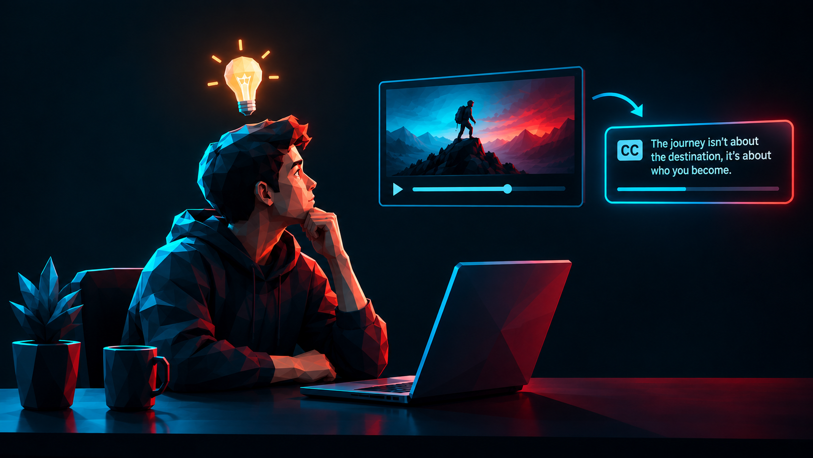
How to Add Caption to a Video Without Making Them Look Like an Afterthought
How to Add Captions to a Video Without Making Them Look Like an Afterthought
Here's the thing nobody tells you about captions: they're not a subtitle file you slap on after you've finished the real work. The real work. As if captions are the homework you do after the fun part. That mindset is exactly why so much short form video editing looks cheap the second the sound is off, which, statistically, is most of the time. If you're serious about cinematic video editing for brands, captions stop being decoration and start being a design decision you make on day one.
Why Most Captions Look Like They Were Added Last
You can spot afterthought captions instantly. White text, black outline, dead center, popping in a beat too late. It works, technically. Nobody's confused about what's being said. But it reads like a chore someone finished at 11pm before a deadline, because it usually was.
The psychology part is simple. Humans process timing and rhythm before they process meaning. If your captions lag the voice, cut awkwardly mid-thought, or sit in a font that has nothing to do with your brand, the viewer's brain flags it as sloppy before they've even read a word. That flag costs you trust, and trust is the entire currency of conversion-focused video editing.
What Actually Makes a Caption Feel Intentional
Timing That Matches Speech, Not a Template
Auto-caption tools are fine for a first pass. They are not fine as a final product. Speech has pauses, emphasis, and rhythm that a default algorithm does not care about. Captions that land a beat with the word being emphasized feel edited. Captions that just appear because a timer said so feel generated. Viewers can tell the difference even if they couldn't explain why.
Typography That Belongs to the Brand
If your captions use a random default font, you've quietly told the viewer this video wasn't worth customizing. Brand identity design should extend into your caption style the same way it extends into your logo or your website. Same font family, same color logic, same personality. A caption is still a visual element. Treat it like one.
Placement That Respects the Frame
Center-bottom captions covering half the shot is a decision made by nobody, which is how you know it was never actually decided. Good placement considers what's happening in the frame, where the eye already wants to go, and how much of the shot you're willing to sacrifice. Sometimes that means captions live in a lower third. Sometimes it means they move with the subject. It should never mean they're just there because that's where the template put them.
Motion With a Reason
Word-by-word pop captions became popular because they hold attention on short form platforms, and holding attention is the entire job of the first three seconds. But motion without intent turns into noise fast. The emphasis, the pacing, the little bounce on a keyword, that should be doing something, either adding humor, adding tension, or adding clarity. If it's not doing one of those three, it's just movement for the sake of movement.
How Chaos Version Actually Does This
We build captions into the storyboard stage, not the export stage. Before a single clip is cut, we already know how the caption style supports the brand's voice, because that's part of what a psychology-driven creative agency is supposed to figure out before touching the timeline.
In practice that looks like three things. First, we design a caption system per brand, not per video, so every piece of content someone posts feels like it came from the same place. That consistency is part of what turns a one-off video into actual content strategy for brands rather than a random upload. Second, we hand-time emphasis instead of trusting a default algorithm, because a caption that hits the punchline half a second early kills the punchline. Third, we treat captions as part of the visual identity, the same font logic and color logic that shows up if a client also comes to us for web design for personal brands and creators or a full brand filmmaking package.
None of this is complicated. It's just not skipped. Most creative agencies treat captions as a checkbox because clients rarely ask about them directly. We treat them as the difference between a video someone watches on mute for two seconds and a video someone watches all the way through on mute, which is most people, most of the time.
The Small Detail That Changes Everything
If you remember one thing from this: captions are not proof that a video has sound. They are a second performance happening in text. Treat them with the same care you'd give the actual edit, and the difference shows up immediately, in watch time, in shares, in whether the video feels like a small brand's DTC content or a serious one's.
If you're staring at a video right now wondering why the captions feel off and can't put your finger on why, that's usually not a you problem, it's a timing and typography problem. Happy to take a look if you want a second opinion. No pitch, just a real answer.
Tags/Keywords: cinematic video editing for brands, short form video editing, conversion-focused video editing, brand identity design, psychology-driven creative agency, content strategy for brands, social media content creation agency.


